Optimised User Experience
Optimised User Experience
Optimised User Experience
Optimised User Experience
Ran heuristic evaluation leading to a 10% increase in screen views per session
Ran heuristic evaluation leading to a 10% increase in screen views per session
Ran heuristic evaluation leading to a 10% increase in screen views per session


Role
Role
Product UX/UI Designer
Product UX/UI Designer
Product UX/UI Designer
Product UX/UI Designer
Tools
Tools
Figma and FigJam
Figma and FigJam
Figma and FigJam
Figma and FigJam
Contributors
Contributors
1 Product Manager, 2 Designers, and 1 Design Manager – mainly for supervision & feedback
1 Product Manager, 2 Designers, and 1 Design Manager – mainly for supervision & feedback
1 Product Manager, 2 Designers, and 1 Design Manager – mainly for supervision & feedback
1 Product Manager, 2 Designers, and 1 Design Manager – mainly for supervision & feedback
Challenge
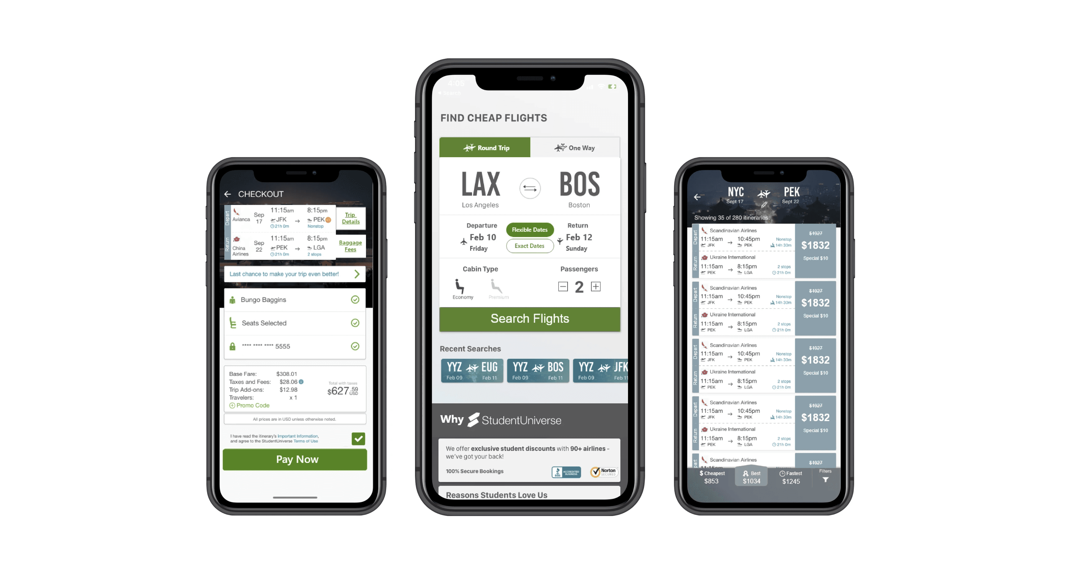
We were tasked with enhancing their mobile app's user experience. With a specific emphasis on usability improvements, our goal was to elevate key user engagement metrics, ensuring a more seamless and enjoyable experience for our users.
Results
The result of our dedicated efforts was a remarkable 10% increase in screens viewed per session. These improvements not only made the app more accessible to a broader audience but also significantly enhanced the overall user experience, aligning it with industry-leading design principles.
10%
10%
10%
10%
Increase in screens viewed per session
Increase in screens viewed per session
Increase in screens viewed per session
Context
Context
Context
Context
When I first joined StudentUniverse, we were handed the exciting task of giving the app a complete makeover. Our goal was to make it look more modern, improve its design, and incorporate the best practices we've learned from user feedback.
As we brainstormed how to tackle this big project, we were eager to make a real difference. We had to figure out the best way to approach it and make sure our efforts would have a lasting impact.
THE PROBLEM
Plot Twist: The Stakeholders' Call to Action in the StudentUniverse App Redesign
Plot Twist: The Stakeholders' Call to Action in the StudentUniverse App Redesign
Plot Twist: The Stakeholders' Call to Action in the StudentUniverse App Redesign
Plot Twist: The Stakeholders' Call to Action in the StudentUniverse App Redesign
However, our plans took an unexpected turn when we received word from the stakeholders. They informed us that due to time and resource constraints, we would only be focusing on improving key screens rather than redesigning the entire app.
This decision was grounded in the reality of our startup environment, where resources are limited, and every decision must be made with careful consideration. With a small team, we knew we had to be strategic in our approach to ensure maximum impact with the resources available.
APPROACH
Running heuristic evaluation seemed like a good option..
Running heuristic evaluation seemed like a good option..
Running heuristic evaluation seemed like a good option..
Running heuristic evaluation seemed like a good option..
With our limited time and budget, and the need to focus on just a few screens, we had to figure out the best way to tackle the problem. That's when we decided to do a heuristic evaluation. This method involves checking the user interfaces for design problems using a set of guidelines. It's a budget-friendly way to find UX issues without needing to recruit and test participants.
First of all, we use the 10 heuristic principles and then match the findings with the relevant heuristic (guidelines). The following heuristics are used in this report.
We apply these 10 heuristics and match findings accordingly
We apply these 10 heuristics and match findings accordingly
We apply these 10 heuristics and match findings accordingly
We apply these 10 heuristics and match findings accordingly


Starting the evaluation as if we are a user trying to complete a task..
Starting the evaluation as if we are a user trying to complete a task..
Starting the evaluation as if we are a user trying to complete a task..
Starting the evaluation as if we are a user trying to complete a task..
We established prerequisites before starting the evaluation:
Observation collection tool: FigJam
Scope: One screen of the app at a time
Evaluation: Conducted independently
We established prerequisites before starting the evaluation:
Observation collection tool: FigJam
Scope: One screen of the app at a time
Evaluation: Conducted independently
We established prerequisites before starting the evaluation:
Observation collection tool: FigJam
Scope: One screen of the app at a time
Evaluation: Conducted independently
We established prerequisites before starting the evaluation:
Observation collection tool: FigJam
Scope: One screen of the app at a time
Evaluation: Conducted independently
But how do we exactly use these heuristics to inform our design decisions?
But how do we exactly use these heuristics to inform our design decisions?
But how do we exactly use these heuristics to inform our design decisions?
But how do we exactly use these heuristics to inform our design decisions?
We began by independently attempting to book a flight ticket on the app. Starting with the home screen, we documented the issues we encountered altogether in a FigJam file.
We began by independently attempting to book a flight ticket on the app. Starting with the home screen, we documented the issues we encountered altogether in a FigJam file.
We began by independently attempting to book a flight ticket on the app. Starting with the home screen, we documented the issues we encountered altogether in a FigJam file.
We began by independently attempting to book a flight ticket on the app. Starting with the home screen, we documented the issues we encountered altogether in a FigJam file.
Home screen
Home screen
Home screen


Why were those issues identified on the "home screen", and why were changes recommended?
Why were those issues identified on the "home screen", and why were changes recommended?
Why were those issues identified on the "home screen", and why were changes recommended?
Points 1 and 5 do not align with the heuristic of "visibility of system status": users need to know their current tab to navigate effectively. Without a clear visual cue, they might feel disoriented. Hence, we suggested increasing the button contrast ratio per WCAG AA guidelines.
Points 1 and 5 do not align with the heuristic of "visibility of system status": users need to know their current tab to navigate effectively. Without a clear visual cue, they might feel disoriented. Hence, we suggested increasing the button contrast ratio per WCAG AA guidelines.
Points 1 and 5 do not align with the heuristic of "visibility of system status": users need to know their current tab to navigate effectively. Without a clear visual cue, they might feel disoriented. Hence, we suggested increasing the button contrast ratio per WCAG AA guidelines.
Points 1 and 5 do not align with the heuristic of "visibility of system status": users need to know their current tab to navigate effectively. Without a clear visual cue, they might feel disoriented. Hence, we suggested increasing the button contrast ratio per WCAG AA guidelines.
Point 2 contradicts the heuristic of "match between system and the real world": users expect buttons to indicate their tappability clearly. Without this indication, they may hesitate to interact, disrupting their expected user experience. Consequently, we proposed making the swap icon resemble a button, ensuring users recognize it as interactive.
Point 2 contradicts the heuristic of "match between system and the real world": users expect buttons to indicate their tappability clearly. Without this indication, they may hesitate to interact, disrupting their expected user experience. Consequently, we proposed making the swap icon resemble a button, ensuring users recognize it as interactive.
Point 2 contradicts the heuristic of "match between system and the real world": users expect buttons to indicate their tappability clearly. Without this indication, they may hesitate to interact, disrupting their expected user experience. Consequently, we proposed making the swap icon resemble a button, ensuring users recognize it as interactive.
Point 2 contradicts the heuristic of "match between system and the real world": users expect buttons to indicate their tappability clearly. Without this indication, they may hesitate to interact, disrupting their expected user experience. Consequently, we proposed making the swap icon resemble a button, ensuring users recognize it as interactive.
Point 3 diverges from the "user control and freedom" heuristic: users prioritize app exploration and understanding action consequences. Without clear indications, they might hesitate, feeling a lack of control. Hence, we proposed displaying "exact" and "flex" options as small selectable buttons to enhance discoverability.
Point 3 diverges from the "user control and freedom" heuristic: users prioritize app exploration and understanding action consequences. Without clear indications, they might hesitate, feeling a lack of control. Hence, we proposed displaying "exact" and "flex" options as small selectable buttons to enhance discoverability.
Point 3 diverges from the "user control and freedom" heuristic: users prioritize app exploration and understanding action consequences. Without clear indications, they might hesitate, feeling a lack of control. Hence, we proposed displaying "exact" and "flex" options as small selectable buttons to enhance discoverability.
Point 3 diverges from the "user control and freedom" heuristic: users prioritize app exploration and understanding action consequences. Without clear indications, they might hesitate, feeling a lack of control. Hence, we proposed displaying "exact" and "flex" options as small selectable buttons to enhance discoverability.
Point 4 ignores the "recognition rather than recall" heuristic: users prefer familiar formats to reduce cognitive load. The unconventional date format introduced unnecessary confusion and frustration. Therefore, we recommended using a conventional format familiar to users.
Point 4 ignores the "recognition rather than recall" heuristic: users prefer familiar formats to reduce cognitive load. The unconventional date format introduced unnecessary confusion and frustration. Therefore, we recommended using a conventional format familiar to users.
Point 4 ignores the "recognition rather than recall" heuristic: users prefer familiar formats to reduce cognitive load. The unconventional date format introduced unnecessary confusion and frustration. Therefore, we recommended using a conventional format familiar to users.
Point 4 ignores the "recognition rather than recall" heuristic: users prefer familiar formats to reduce cognitive load. The unconventional date format introduced unnecessary confusion and frustration. Therefore, we recommended using a conventional format familiar to users.
Then, we moved on to the "choose itineraries screen" that shows after we click on search flights.
Then, we moved on to the "choose itineraries screen" that shows after we click on search flights.
Then, we moved on to the "choose itineraries screen" that shows after we click on search flights.
Then, we moved on to the "choose itineraries screen" that shows after we click on search flights.
Choose itineraries screen
Choose itineraries screen
Choose itineraries screen


Why the issues on the "Choose itineraries screen", and why the recommendations?
Why the issues on the "Choose itineraries screen", and why the recommendations?
Why the issues on the "Choose itineraries screen", and why the recommendations?
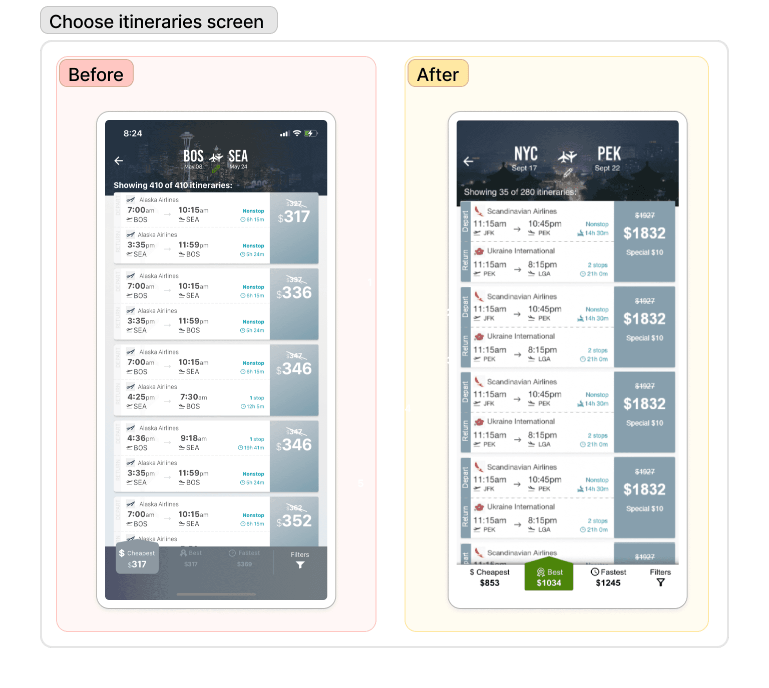
These issues collectively violate the "Visibility of system status" heuristic, which stresses the importance of making critical information clearly visible and understandable to users. Insufficient contrast and clarity in UI elements undermine users' ability to discern and comprehend important information, thus violating this heuristic.
Consequently, our focus on this screen was to enhance contrast, ensuring better visibility and perception for users.
Then, we moved on to the "checkout screen".
Then, we moved on to the "checkout screen".
Checkout screen
Checkout screen
Checkout screen

Why the issues on the "checkout screen", and why the recommendations?
Why the issues on the "checkout screen", and why the recommendations?
Why the issues on the "checkout screen", and why the recommendations?
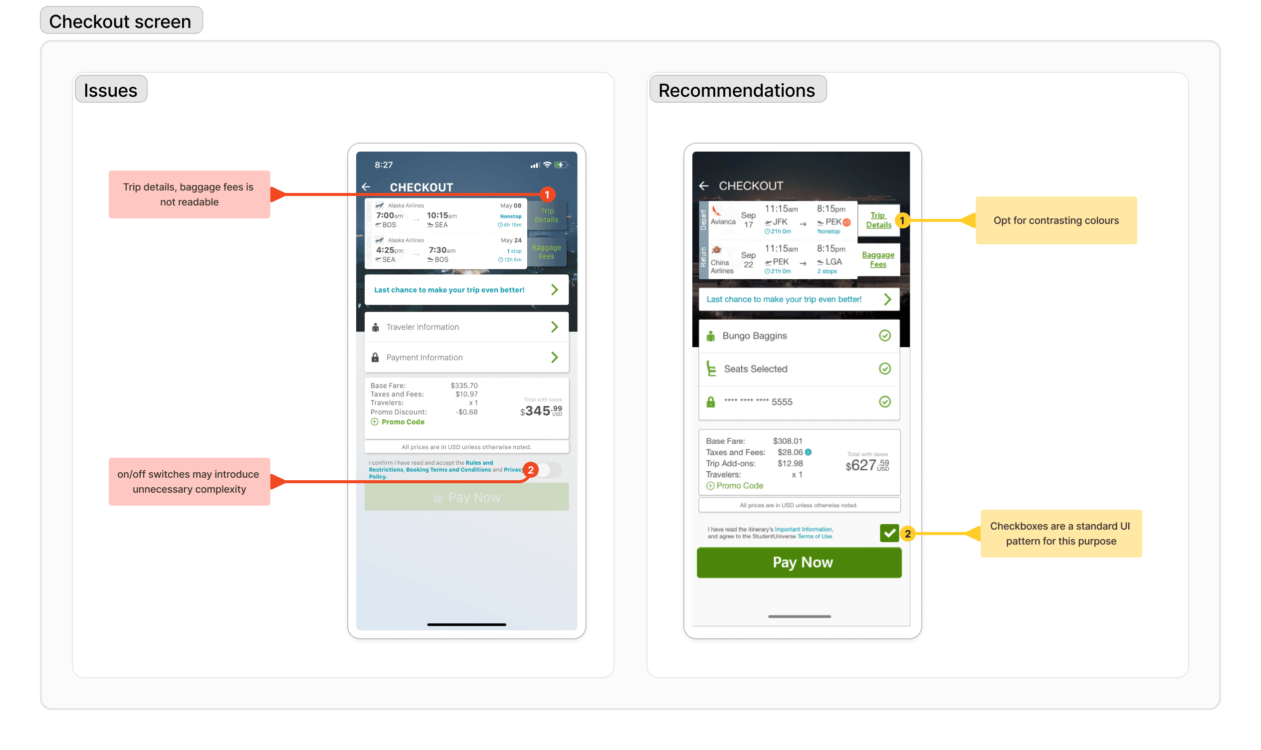
Point 1 primarily violates the "visibility of system status" heuristic. Users may struggle to discern baggage fee status if not clearly visible, impacting trip detail understanding. Therefore, opting for contrasting colors made sense.
Point 2 deviates from the "consistency and standards" heuristic by using an on/off switch instead of the standard checkbox format for agreeing to terms and conditions. This inconsistency may lead to confusion and a lack of familiarity for users, impacting their overall experience. Therefore, replacing it with a standard checkbox format improves clarity and aligns with user expectations.
Then, we moved on to the "Traveler Information screen."
Then, we moved on to the "Traveler Information screen."
Then, we moved on to the "Traveler Information screen."
Traveler Information screen
Traveler Information screen
Traveler Information screen


Why the issues on the "traveler information screen", and why the recommendations?
Why the issues on the "traveler information screen", and why the recommendations?
Why the issues on the "traveler information screen", and why the recommendations?
Point 1 is related to the "visibility of system status" heuristic. If the price and passenger count are not clearly visible or easily understandable, users may struggle to comprehend the current status of their booking, affecting their decision-making process. Therefore, we suggested differentiating between these two fields.
Point 2 also aligns with the "visibility of system status" heuristic. If the progress stepper is not easily noticeable or discernible, users may have difficulty tracking their progress through the booking process, leading to frustration and potential errors. Hence, we made the progress stepper more visible and larger.
Point 3 corresponds to the "consistency and standards" heuristic. If the use of badges for genders deviates from common industry standards or conventions, it may confuse users accustomed to a different approach, undermining the overall user experience. Therefore, we recommended using radio buttons for gender selection and offering more options to promote inclusivity.
Point 4 violates the "match between the system and the real world" heuristic. This heuristic suggests that users expect interactive elements, such as buttons, to adhere to real-world conventions. Since the "Next" button is a primary action on the screen, users would expect it to be visually prominent and follow standard button design conventions.
After all the synthesis, we moved to discussion and asking questions.
After all the synthesis, we moved to discussion and asking questions.
After all the synthesis, we moved to discussion and asking questions.
After all the synthesis, we moved to discussion and asking questions.
Consolidating identified issues with the team..
Consolidating identified issues with the team..
Consolidating identified issues with the team..
Consolidating identified issues with the team..
Once we were done identifying and synthesizing the issues, we started to discuss on:
Once we were done identifying and synthesizing the issues, we started to discuss on:
Once we were done identifying and synthesizing the issues, we started to discuss on:
Once we were done identifying and synthesizing the issues, we started to discuss on:


A presentation of this synthesis with the stakeholders to outline the next steps together
A presentation of this synthesis with the stakeholders to outline the next steps together
A presentation of this synthesis with the stakeholders to outline the next steps together
A presentation of this synthesis with the stakeholders to outline the next steps together
After presenting the entire presentation, they were happy to see improvements in the app's user experience and gave a positive response to the before and after screens.
After presenting the entire presentation, they were happy to see improvements in the app's user experience and gave a positive response to the before and after screens.
After presenting the entire presentation, they were happy to see improvements in the app's user experience and gave a positive response to the before and after screens.
After presenting the entire presentation, they were happy to see improvements in the app's user experience and gave a positive response to the before and after screens.
How did it work? — The Rollout
How did it work? — The Rollout
How did it work? — The Rollout
How did it work? — The Rollout
We subsequently moved on to the crucial phase of handing off the designs to the development team and fostering a strong collaboration.
The process had its challenges, especially in terms of gaining support for our recommendations from stakeholders. In the end, it was the collaboration and synergy with the development team that allowed us to successfully implement some of the key changes. The result was a significant 10% increase in screen views per session—a meaningful KPI to measure the impact of UI improvements.
Although there was a pivot in project requirements, here's what I learned:
Although there was a pivot in project requirements, here's what I learned:
Although there was a pivot in project requirements, here's what I learned:
Although there was a pivot in project requirements, here's what I learned:
Learning to adapt and find solutions: This project revealed the delicate art of balancing ideal design solutions with practical constraints. While it's important to strive for the best user experience, real-world projects often have constraints such as time, resources, and business needs.
Importance of communication: Effective communication was key. Presenting designs to stakeholders and development teams required clear articulation of their value. Listening to their perspectives and understanding challenges was crucial for gaining support.
This experience taught me that the UX process is anything but linear. It's about adaptability and finding the best solution when circumstances change.


